

The Monthly Indicators Report, available with FastStats in many markets, is a detailed overview of the real estate trends in your MLS, updated each month. The report includes several pages of key metrics and insights, covering each aspect of the market and painting an overall clearer picture of the market.
Below are some highlights of the data available to you and how you can use it to discuss trends with your clients.
Market Overview
On the first page of the report, there are a few paragraphs of text that are updated each month providing commentary on overall housing and economic activity nationwide as well as some key local data from the month. There’s also a Quick Facts section that highlights the percentage of change in three important statistics that will vary depending on your market. In the below example you can see changes in the number of closed sales, median sales price and homes for sale.
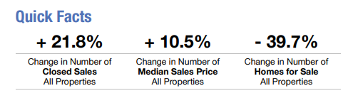
The summary as well as the quick facts are great bits of data to share with your clients both past and present. You could send out a monthly email with this content as a touch point to keep you top of mind and position you as a market expert.
The next several pages vary by market and contain more detailed overviews of key metrics from the month compared to the same month in the previous year, as well as year-to-date (YTD) data starting from the first of the year. There are also graphs to give a visual overview of what has occurred. These pages are broken down, usually by property type (single-family detached, townhouse/condo attached). Some of the metrics that may be covered in the overviews include New Listings, Pending and Closed Sales, Days on Market (DOM), Average and Median Sales Prices, Inventory, and more.

A Deeper Dive
Next, each metric covered in the previous content has its own page that takes a deeper dive into the metric’s specific data. These are complete with a bar chart, line graph and a table with numeric data. The bar chart compares the last three years while the line graph goes back even further. The data table gives you the exact numbers displayed by these charts. Each of these in-depth analysis pages puts the property types side by side for another comparison. You can see an example of this in the Pending Sales page below, where Single-Family data are in red and Townhouse/Condo data are in blue.
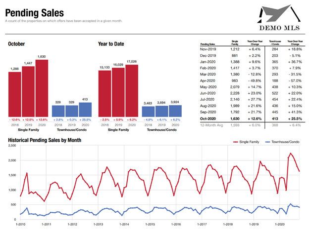
You can use these charts to help your client visualize why they may want to wait to list their home until the middle of the year, as that is when the most pending sales occur. On the other hand, you can see that in this market there are eight percent fewer listing this year than there were in 2019, which may help them to sell their home more quickly since inventory is low. If your seller is impatient after listing their home for a few weeks, use DOM to show them that most homes in their area are listed for around 64 days before selling. Depending on the specific needs of your clients, you can use this data to back up any decisions or adjustments to the property.
FastStats and our other MarketStats products make data approachable. Whether you’re an industry veteran already well-versed in reading and interpreting market data, or you’re new to real estate and can benefit from some helpful guidance, MarketStats will work for you.
If you’re a real estate professional and belong to an MLS that subscribes to MarketStats by ShowingTime+, you already have access to useful reports and charts for every situation.
For MLS and association staff who need to quickly generate reports and charts that summarize local market activity, MarketStats by ShowingTime can help. Click the button below to contact us for more information.

